Why the Footer in a UI Card Is a Small Detail That Delivers Big Impact
How and Why?
Sometimes, the difference between good design and great design is in the tiniest decisions. One of those quiet heroes in UI design? The footer of a card.
Whether you’re designing a car listing app, a product catalog, or a real estate portal, UI cards are everywhere. They’re compact, digestible units of information meant to give users just enough to spark interest — but not so much that it overwhelms them.
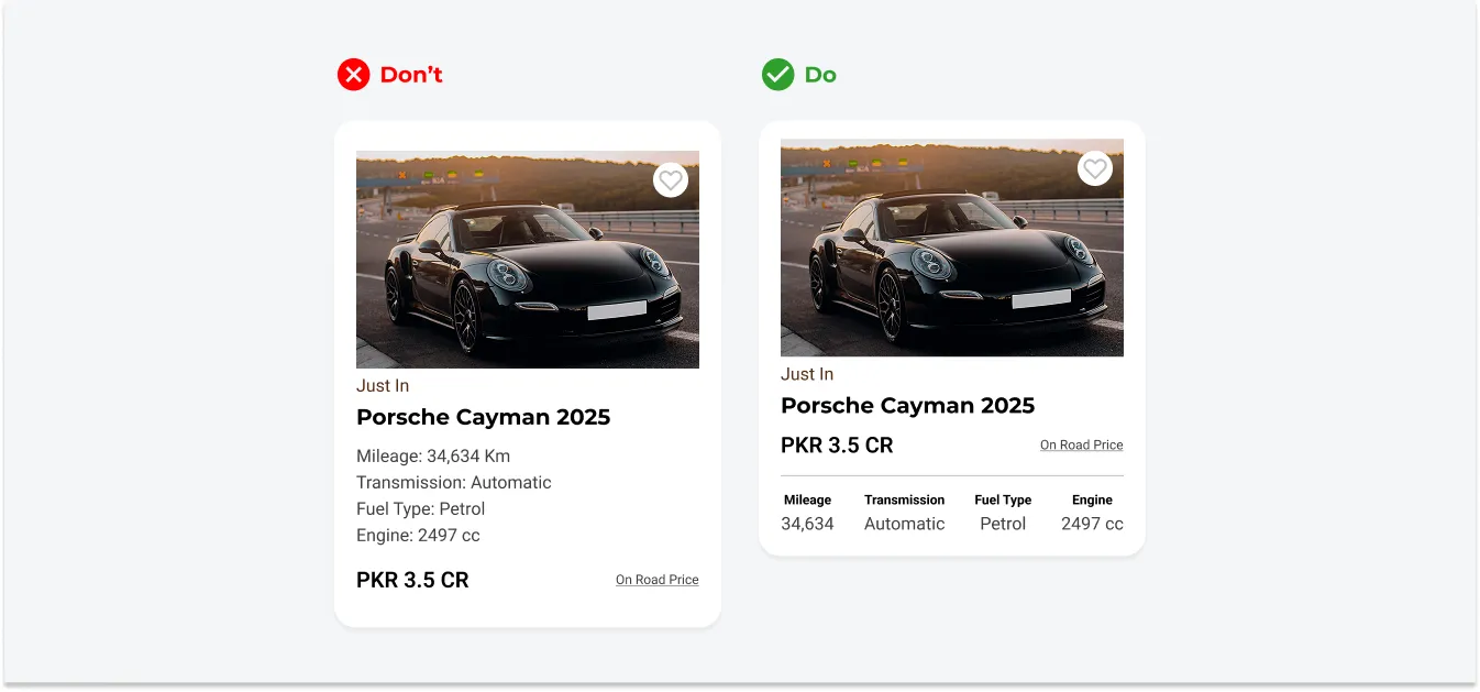
But what separates a cluttered card from a clean, scannable one?👉 The placement of your meta data — and more specifically, using a card footer.Let’s break down why the footer is a tiny UX power move.
It Guides the Eye with Natural Flow
Humans scan content from top to bottom, left to right (for most languages). A well-structured card mirrors this:Top: Visual (image)
Middle: Primary info (title, price)
Bottom: Secondary info (meta data)
Placing the meta data — like mileage, engine type, or transmission — in the footer supports a logical reading order. Users get what they need at a glance, without cognitive friction.It Makes Scanning and Comparing Effortless
Think of browsing a list of 10–20 cars. If every card has a scattered layout, your brain has to work harder to compare details like mileage or engine specs.With a footer, that meta data is always in the same spot. Users don’t have to hunt for it — their eyes naturally land there. That consistency builds trust, improves speed, and reduces frustration.It Looks Cleaner (and Feels Lighter)
In a cluttered card, everything is fighting for attention — specs, prices, labels, and descriptions. The card feels busy and chaotic. A footer solves this by:
Grouping similar information together
Creating breathing room for each section
Giving the card a clean, structured appearanceDesign is not just about what you add — it’s about what you organize.
It’s a Best Practice in Modern UI Design
Frameworks like Material Design, Bootstrap, and Carbon all promote using sections (headers, content areas, and footers) in card components.Why? Because it:Encourages modularity
Makes components reusable
Creates predictable layouts for users and developers alikeThis isn’t just a trend — it’s an established UX pattern. Improved UI card with a footer at the bottom to easily separate informationIt Supports Better Accessibility
For users relying on screen readers or assistive tech, a card footer provides a semantic structure that’s easier to interpret.Instead of reading through a wall of unstructured text, they can quickly access a clearly defined section with all the specs they need.Bonus: it’s also more responsive on smaller screens, where content naturally collapses into logical blocks.
It Adds Visual Balance
Ever seen a card that looks top-heavy? That’s what happens when there’s no footer — just a big image and a block of text underneath. It feels like it might topple over.A footer acts as the foundation, giving the card visual weight at the bottom. It’s subtle, but it adds harmony to the design.
Final Thoughts
The best UI isn’t always flashy — sometimes it’s quietly effective.Using a footer in your card layout is one of those smart little decisions that makes everything feel more organized, readable, and user-friendly.In a world where users skim more than they read, and where clarity beats cleverness, a structured card with a clean footer is not just nice to have — it’s the gold standard.
So the next time you’re designing a product or listing card, give the footer the love it deserves. Your users (and your dev team) will thank you for it.
Comments