What Is Apple’s Liquid Glass UI? Everything Designers Should Know

With the release of iOS 26, iPadOS 26, and macOS Tahoe, Apple has introduced a new design language—Liquid Glass. It’s not just a visual update. Liquid Glass is Apple’s most dramatic UI evolution since the flat design revolution of iOS 7. For designers, developers, and UI/UX specialists, this marks a crucial shift in how Apple wants digital experiences to feel: organic, immersive, and context-aware.
✨ What Is Liquid Glass?
Liquid Glass is a system-wide interface framework that simulates the appearance and behavior of optical glass—complete with depth, translucency, fluid motion, and dynamic lighting. Inspired by both visionOS and Apple’s early “Aqua” UI, Liquid Glass introduces real-time responsiveness that adapts to environmental context, making every user interaction feel alive.
🔍 Key Features of Liquid Glass UI
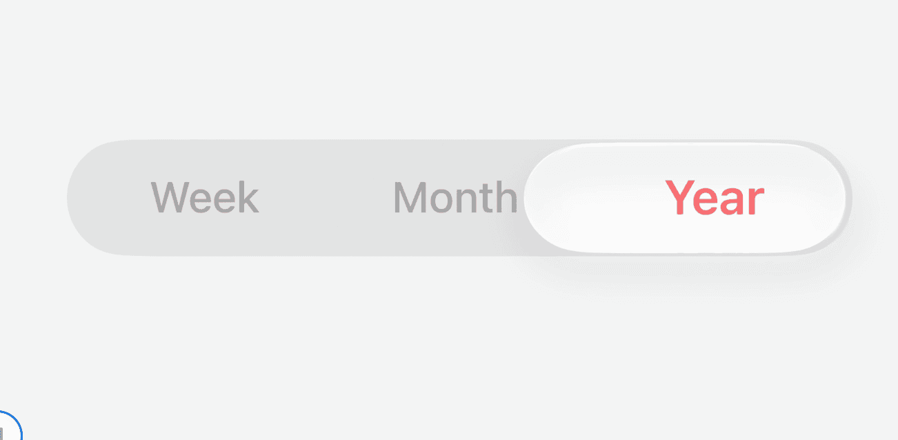
Options Section in iOS26
1. Translucency with Purpose
The interface uses multi-layered transparency that mimics physical refraction—UI elements like menus, control panels, and modals blur and distort content beneath them.
This depth effect brings focus to the active layer while giving background content a gentle visual presence.

Button look in Liquid Glass OS26
2. Fluid, Motion-Responsive Behavior
Buttons and interactive surfaces exhibit fluid dynamics—they stretch slightly, respond with realistic tension, and create highlights that follow the user’s gestures.
These micro-interactions aren’t just aesthetic—they provide tactile feedback and help users intuit the UI’s hierarchy.
3. Context-Aware Tinting
Liquid Glass automatically adjusts colors, saturation, and contrast based on:
Wallpaper tones
Ambient light
System mode (light/dark)
User interaction
This enables dynamic personalization without sacrificing legibility or coherence.
4. Material Realism (Without Skeuomorphism Overload)
While Apple is steering away from flat minimalism, Liquid Glass doesn’t go full skeuomorphic. Instead, it subtly introduces material cues—like gloss, blur, reflection, and edge lighting.
It’s a restrained nod to realism that adds character without clutter.
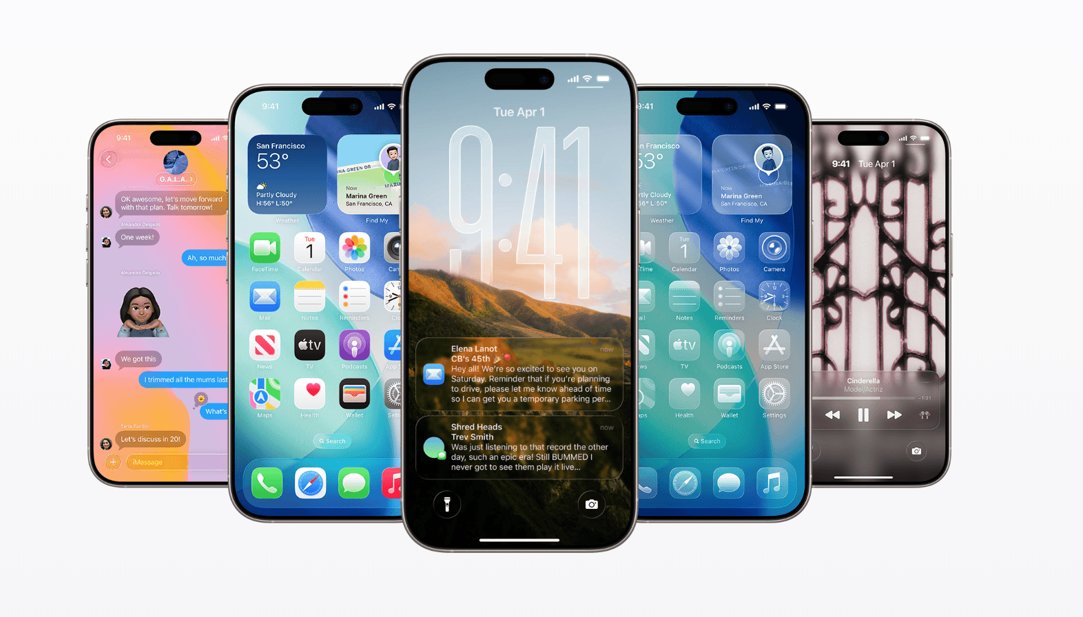
📱 How Liquid Glass Appears Across Devices

Liquid Glass Controls Look
iOS & iPadOS 26
Home screen icons and widgets dynamically shift based on the wallpaper.
The Lock Screen and Control Center use layered glass sheets that animate with swipes and touches.
Notifications reflect the background with gentle blur and shadow realism.
macOS Tahoe
The Dock and Menu Bar are now fully translucent with glass reflections.
Finder windows show tinted glass shells that adapt to the user’s wallpaper and active app state.
Even animations for opening folders and resizing windows have been redesigned to feel more elastic and dimensional.

Transparent Dock in macOS Tahoe 26
watchOS and tvOS
With TV and watchOS On smaller screens, Apple preserved clarity by reducing excessive transparency but kept the animated glass gloss effect for buttons and menus.
watchOS uses lighting highlights and motion to enhance glanceability.
🧠 The Design Philosophy Behind Liquid Glass
Apple’s design team emphasized three core goals:
Emotional Fluidity: Make the interface feel alive and responsive to human gestures.
Spatial Awareness: Let users sense hierarchy and depth through blur, color, and shadow.
Unified Aesthetics: Ensure a consistent visual language across all Apple platforms—from iPhones and Macs to Vision Pro and Apple Watch.
Icons 3D look in liquid Glass OS 26
⚙️ Developer Tools & Integration
To help developers align with this design language, Apple introduced:
Updated UIKit, SwiftUI, and AppKit APIs with Liquid Glass properties
Enhanced SF Symbols with light-reactive variants
A redesigned Icon Composer tool for applying real-time tints and gloss effects
Backward compatibility modes for legacy support
For developers building multi-platform apps, these tools streamline Liquid Glass implementation without rebuilding the entire UI layer.
📈 Pros & Challenges of Liquid Glass
✅ Advantages:
Visual Delight: Adds modern aesthetic appeal without overwhelming the interface.
Consistency: Uniform look across mobile, desktop, and wearables.
Interactivity: Enhances user engagement through micro-animations.
⚠️ Considerations:
Performance: Older devices may experience UI lag due to real-time rendering.
Accessibility: Overuse of transparency can reduce text contrast; Apple includes “Reduce Transparency” toggles in settings.
Legibility: Designers must balance visual depth with clarity, especially on content-heavy screens.
💬 Expert Insight
Design professionals see Liquid Glass as a blend of functional animation and emotionally intelligent UI. It aligns with broader design trends like neumorphism and ambient computing, but is more technically refined and less visually gimmicky.
Some industry insiders speculate this is Apple’s UI foundation for AR wearables—like the Vision Pro and future Apple Glass.
🗓 When Will You Experience It?
Developer beta: Available now via Apple Developer Program.
Public beta: Rolling out July 2025.
Final release: Launches with iPhone 17 and new Macs in Fall 2025.
📌 Final Takeaway
Liquid Glass isn’t just a new skin—it’s a revolution in visual feedback, spatial design, and emotional interface behavior. For designers and developers, it offers a new creative canvas that rewards experimentation, precision, and adaptation.
Whether you're building for iPhone, Mac, or Vision Pro—mastering the nuances of Liquid Glass UI will be crucial for creating apps that feel native, responsive, and future-ready in Apple’s evolving ecosystem.
Comments